A question that I’ve had is what is the profile of a successful triathlete. Are they a jack of all trades, or do they specialize in their strength? Take the person who got first place, and relative to their time, were they a better runner or cyclist?
To look at this, I standardized the scores of the swim, bike, run, and overall time. Standardization is important here because comparing a swim time to a bike time is like apples and oranges – a swim time of 60 minutes is really slow and a run time of 60 minutes is impossibly fast! Standardizing all of the variables allows me to say that a swim time of one standard deviation above the mean (55 minutes) is similar to a bike time of one standard deviation above the mean (200 minutes, or 2 hours and 20 minutes). Complicated? Sorry.
The next step I need to explain is how I control for overall time in a tale of two triathletes.
Swim
Bike
Run
Joe (20th place)
30:00
155:00
117:00
Patrick (1st place)
30:00
124:00
72:00
Joe and Patrick have the same swim time, but Patrick is a whole hour faster than Joe. Joe swam as fast as first place did (Patrick), which is a very impressive feat! Looking at these results will tell us that Joe’s strength is swimming, but he has some weakness on the bike and run. However, we wouldn’t be able to assume that swimming is a relative strength of Patrick. Maybe he is a jack of all trades.
Long story short, I ran a procedure to control for these relative differences in times.
Finally, I ran a two step cluster analysis in SPSS to determine what groups (segments) would organically appear, but I asked it (nicely) no more than nine. Below is a short list of segments based on common strengths we see in the sport.
Swimmers
Bikers
Runners
Swim-Bikers
Swim-Runners
Bike-Runners
Balanced
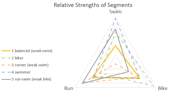
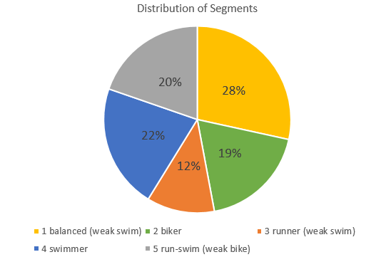
The cluster analysis reported back five groups – balanced (weak swim), bikers, runners (weak swim), swimmers, and run-swimmers (weak bike). There might be more/less groups, but they might not have added any additional goodness-of-fit or statistical helpfulness to the data.
These segments are visualized in the radar chart above where the further the line is from the middle, the better racers are relative to their overall time in that length. Also, the closer to the middle means that it is a relative weakness to their overall time.
The largest segment is the balanced group at 28% of total racers. These people don’t have any dramatic strengths, but appear to struggle a little with the swim more than we would expect given their overall time on average. The largest single strength group are the swimmers at 22%.
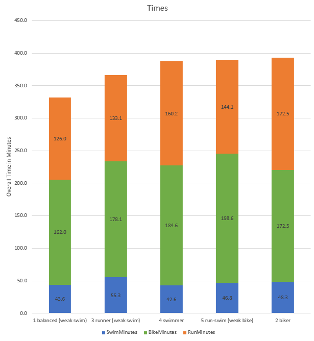
When we look at these groups by segment, we can see that the best triathletes tend to be more balanced on average. What is really interesting is how the swimmer segment has a faster swim time (42 minutes) than the balanced segment (43 minutes). This proves out the reality that the swim portion of a triathlon is the least important in your overall time.
A surprising result is how the bikers are the slowest group on average, but a very common phenomena in a race setting. This group probably goes too hard on the bike, and that leaves them too tried to be competitive on the run giving them the slowest time on average.
One of my favorite multisport races is the Half Ironman series – one mile swim, 56 mile bike, 13 mile run. It is long enough where nutrition and hydration is important, but short enough where you cannot ease the pace if you want to place well.
After you can finish a Half Ironman, the next step is to try to do it faster and qualify for the championships (usually top 3 get invited). A question I have is what does a successful triathlete look like? Do the best triathletes have one common strength (swim, bike, or run), or do they have no weaknesses? Does the model for success change by age group or gender?
Descriptives show that on average, it takes people 46 minutes to complete the swim, 177 minutes to complete the bike (3 hours), and 146 minutes to complete the run (2 hours and 30 minute) for a total time around 381 minutes (6 hours).
From this we might suspect that since the swim is so short, and the bike is so long, that the swim is the least important length, and the bike is the most important. The swim has less time to lose and the bike has more time to lose, therefor athletes with limited amount of time should emphasize their bike training over their swim training.
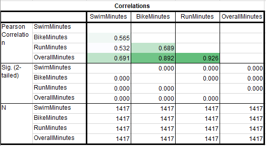
However, if we run correlations between all of the times, the strongest correlation with a racer’s overall time is the amount of minutes spent running (r = .926), followed closely by their bike time (r = .892). Using this data, a data conscious athlete should make sure that they are a slightly better runner than they are a cyclist, and not worry about their swim training as much. But does this pattern hold up for men and women?
Yes, the correlations between overall time and swim, bike, and run times are very similar for men and women. Do we see a difference by division?
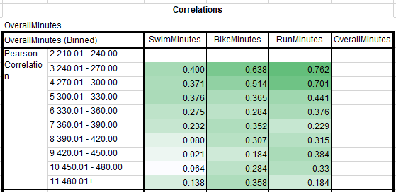
Above is a correlation table filtered for only correlations with Overall Minutes. Each row gives me the correlations between the swim, bike, and run with their overall time. This is why OverallMinutes is blank because OverallMinutes correalted with itself is 1.
While there are some groups where the bike time has a higher correlation with overtime than run time, there isn’t a consistent pattern. Like with gender, people in different age groups are more similar than different when it comes to what the athlete needs to do to place well within their division. The swim is the least important, and running is slightly more important that cycling.
A final thought is that does the model for success for someone who wants to do well when they want to finish in under 5 hours the same than someone who wants to finish in under 8 hours?
This is another correlation table split into ten groups in 30 minute finish intervals. One person finished in the 210 to 240 minute bucket (3.5 hours to 4 hours), so I cannot calculate the correlations with only one case.
What is interesting is that the relationship between overall time and run time compared to overall and bike time is much more important at the most competitive levels of triathlon. One explanation for this is that going from 21 to 22 mphs on the bike requires exponentially more power than it does to go from 9 mph to 10 mph on the run with air resistance alone. It is very likely that there is an upper limit on bike speed where being a better cyclist has diminishing returns. Since air resistance is less of a factor at lower speeds, like running, this is why doing better on the run has a stronger relationship with overall time for elite athletes.
For athletes who take longer than 360 minutes (6 hours) to finish, the run becomes less important relative to the bike. Going back to air resistance, this is likely because those average triathletes are not racing at speeds where there are diminishing returns for going faster on the bike.
One of the problems with correlations is that they only look at two variables at a time, and don’t give a comprehensive understanding of the relationship between all of the variables. We could run a (least ordinal squares) linear regression that would give us standardized beta weights, but I don’t like that because the interpretation is difficult. I also have nerdy reasons why I don’t like linear regression because it maximizes prediction over interpretation.
A quick note on why I’m not interested in prediction is because I can just add up a racers swim time, bike time, and run time to get their overall time. What I want to know is which variable is the most important.
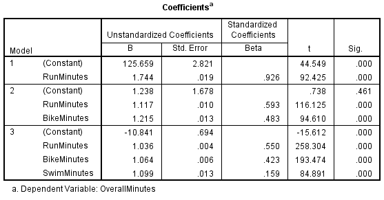
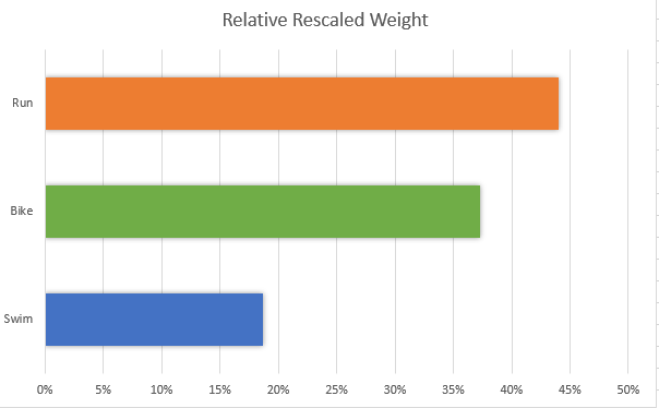
An alternative is to run a relative weights linear regression. On a statistical level, it handles the problem of high correlations between your predictors better. The most helpful aspect of a relative weights linear regression model is that all of the variables add up to 100%, pictured below.
The relative weights model above shows us that running is the most important length in this triathlon, accounting for 44% of the explainable variance. Compare this to the run accounting for an average of 38% of the total time (146 minutes / 381 minutes from the descriptives).
Summary of findings
Gender differences? More like gender similarities.
The model for success doesn’t differ by division.
The more competitive you are, the more important the run is.
Across many different methods, the run is the most important length to do well in.
In the last post, we figured out where the stats data is stored and that it is stored in an XML format. Did I mention XML? It is a cool data storage format that defies regular one line : one case table formats.
For our purposes, XML helps us manage things like the amount of kills people have with guns. Imagine a giant excel dataset with one column for each kill a player has. Since Putin has around 60,000 kills, that means we would need at least 60,000 columns for every variable we want to track.
Kills
With what weapon
On what map
Who was the victim
Where on the map was the killer
Where on the map was the victim killed
How far away was the kill
In that example above, we would need 60,000 columns multiplied by 7 variables to captured all of Putin’s data in a flat table.
Shovel – recorded by Swift
Instead, XML makes a new line for every event, then it is up to us to figure out how to organize the data.
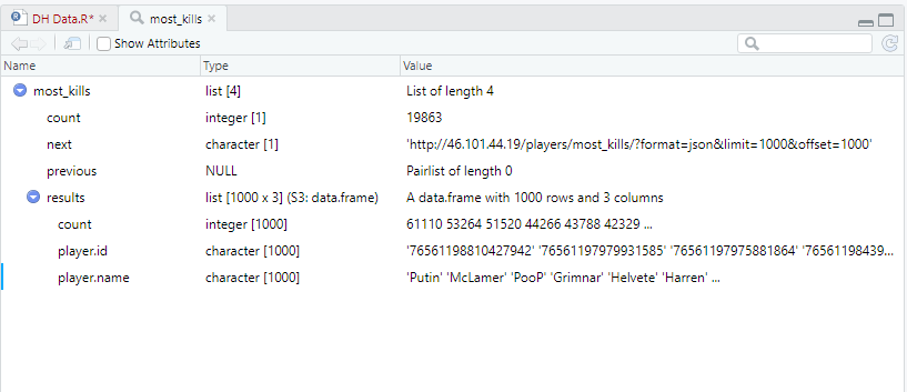
R has a package called jsonlite that allows us to wrangle this data, so let’s go ahead and install a bunch of packages, and load them. We will then point the package to scrape the data from the stats page, and see what it gives us.
This is what that code produces. This isn’t what I expected. Normally when you load data, you get a data set with rows and columns. Not to worry, this is just XML’s way of trying to be friendly. I can ask it to flatten the data set for me and display that instead. For good measure, I’ll store it as a separate data frame.
Something I cannot figure our right now is how to choose what name to display. Some players change their in game name, and all of those names get stored in this XML file. For example, MDK has changed his name to mojo, and now Owls. I’ll want to figure out how to select the first, the last, or show all instances of names, but I’ll leave that for later.
Graphing time!
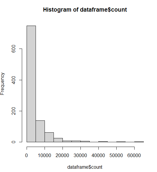
Let’s make a basic plot based on the count variable. “Counts” is just what kills are called from the database. Let’s look at the distribution of kills among Darkest Hour players.
# histogram with added parameters
hist(dataframe$count,
     main="Distribution of kills in DH top 1,000",
     xlab="Kills",
     breaks=100)
This graph does not have enough breaks. Basically, 90% of the player base has less than 5,000 kills. We need more groups to see the distribution.
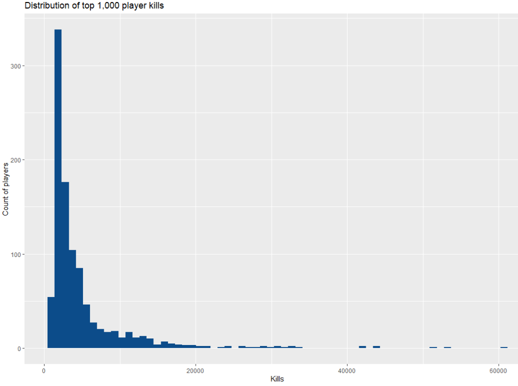
ggplot(dataframe) +
  aes(x = count) +
  geom_histogram(bins = 65L, fill = "#0c4c8a") +
  labs(x = "Kills", y = "Count of players", title = "Distribution of top 1,000 player kills") +
  theme_gray()
Much better.
Basically, most of the people who have played DH have not even cracked 500 kills. That’s a real shame because we must lose a lot of people before they get addicted to the game, but DH isn’t for everyone. The skill ceiling is pretty steep initially, but the punishment you take from RafterMan is worth it.
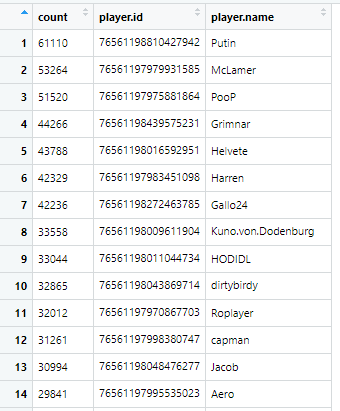
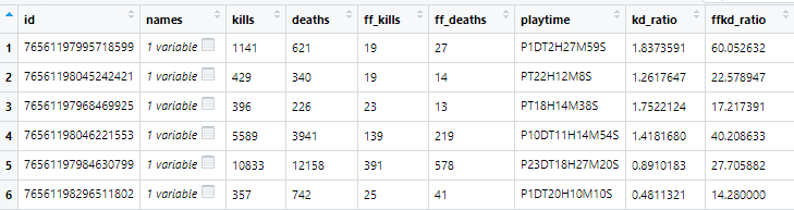
Now I am going to pull from a different XML table that will give me player name, kills, deaths, friendly fire kills, and friendly fire deaths. I’m going to pull the data, calculate some kill:death ratios and kills:friendly fire kill ratios. Finally, i want to get rid of players that have less than 10 kills for graphing purposes. Players with low amount of kills can give us infinite kill:death ratios, and i am more interested in the average DH player with more than 10 kills.
Finally, let’s get graphing! Let’s brain storm a bit and think about what we should graph.
Graphing kills and deaths is possible, but probably not interesting. The more you play, the more kills and deaths players over time will get. It is largely a function of time, and we would see skillful players having a high kill with the lowest possible deaths.
One aspect of skill that we can measure is the amount of friendly fire kills a player has. Friendly fire kills want to be avoided as much as possible. Killing a teammate locks your guns, lowers your score dramatically, and frustrates your teammate. Reducing your friendly fire kills is a skill because you have to learn team uniforms (Germany, Russian, British, American), gun noises of different guns (Kar, mousin, garand) and vehicles (t34, sherman, panzer, StuGs). Being able to identify who is friendly and who is foe quickly will give you the edge on an enemies position, and make sure that you don’t actively hinder your own team.
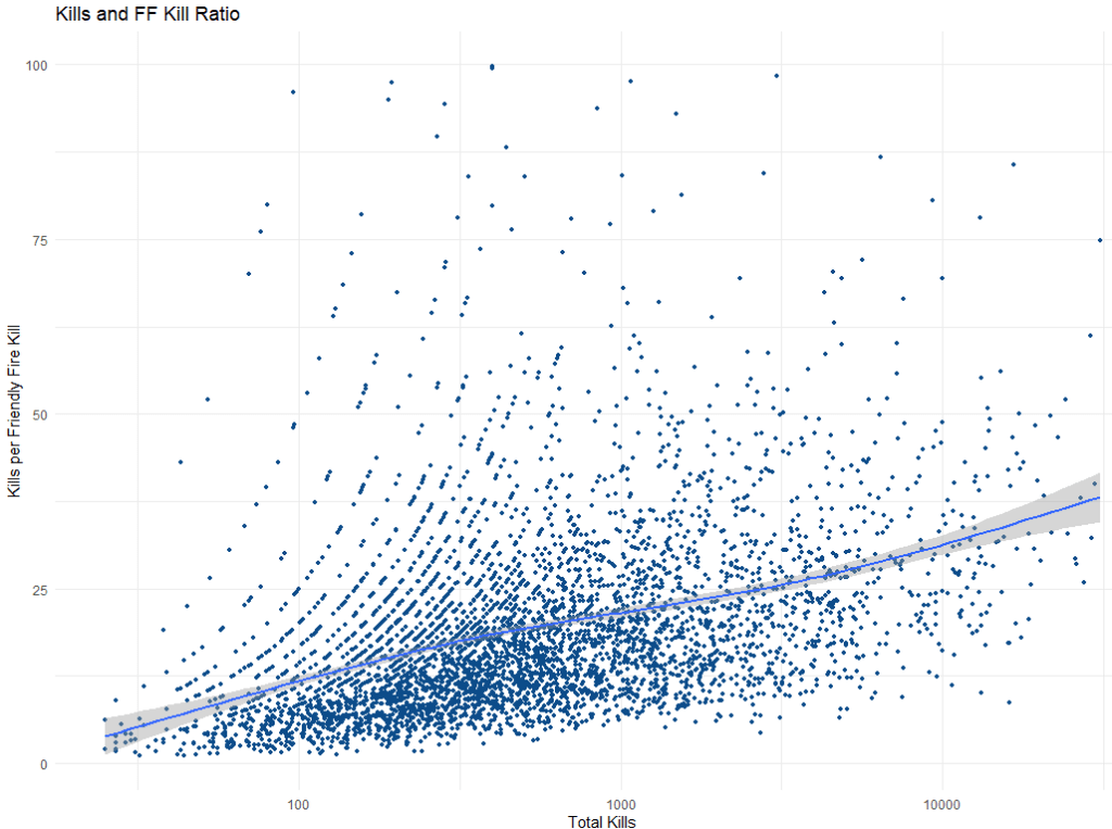
So what does the friendly fire rate between new and experienced players look like if we measure experience as the amount of total kills that people have?
newdata %>%
 filter(kills >= 25L & kills <= 31000L & ffkd_ratio <= 100) %>%
 ggplot() +
 aes(x = kills, y = ffkd_ratio) +
 geom_point(size = 1L, colour = "#0c4c8a") +
 geom_smooth(span = 0.75) +
 scale_x_continuous(trans = "log10") +
 labs(x = "Total Kills", y = "Kills per Friendly Fire Kill", title = "Kills and FF Kill Ratio") +
 theme_minimal()
The Y axis tells us how many enemy kills a player gets on average for every one team mate they kill (hopefully on accident). As a player gets more total kills, they kill fewer teammates too.
Players with around 100 kills kill a teammate one out of every 12 kills. Once players earn 1000 kills, then they only kill a friendly one out of 20 kills. Your vets have around 10,000 kills only kill a friendly solider once every 30 kills.
Coming analyses
Below are ideas for analyses on my to do list. I’ll sort the analyses from what I want to answer first to last, but I may jump around if I get stuck on a problem.
Figure out each players’ top nemesis. Which individual player has killed you the most?
Figure out each players’ top victim. Which individual player do you bully kill the most? An important thing to note is that we do not know who we kill anymore. We might only have the slightest idea based on how we know regular players like to play (Eksha flanking with a rifle, Harren holding with a MG, Kuno committing war crimes in a StuG).
Are there detectable segments of players who use different groups of weapons (tankers, riflemen, machine gunners)?
Are there factional preferences (German, American, British, Russian)? Keep in mind, we have to control for the German bias since Germans are playable on every map, and American, British, and Russian depend on the map.
Does weapon preference change with experience?
Feel free to leave a comment below or message me on discord ( [Wyle]ShermanJesus ) if you have any analysis suggestions.
One of my favorite games to play is called Darkest Hour. It is a mod based on a realism world war 2 first person shooter from 2006. The game can be so intense at times that I like to joke that I go to work to relax. The community is small, but loyal with regulars playing every night, and a devoted international development team still pushing out new maps, weapons, tanks, and game play systems.
Before I get too gushy, one of the tools the devs made was a statistics page that gets updated on some regular cadence. I have always wanted to learn how to scrape data from the web, put it into some statistics software like R or SPSS, and see if I could glean any insights.
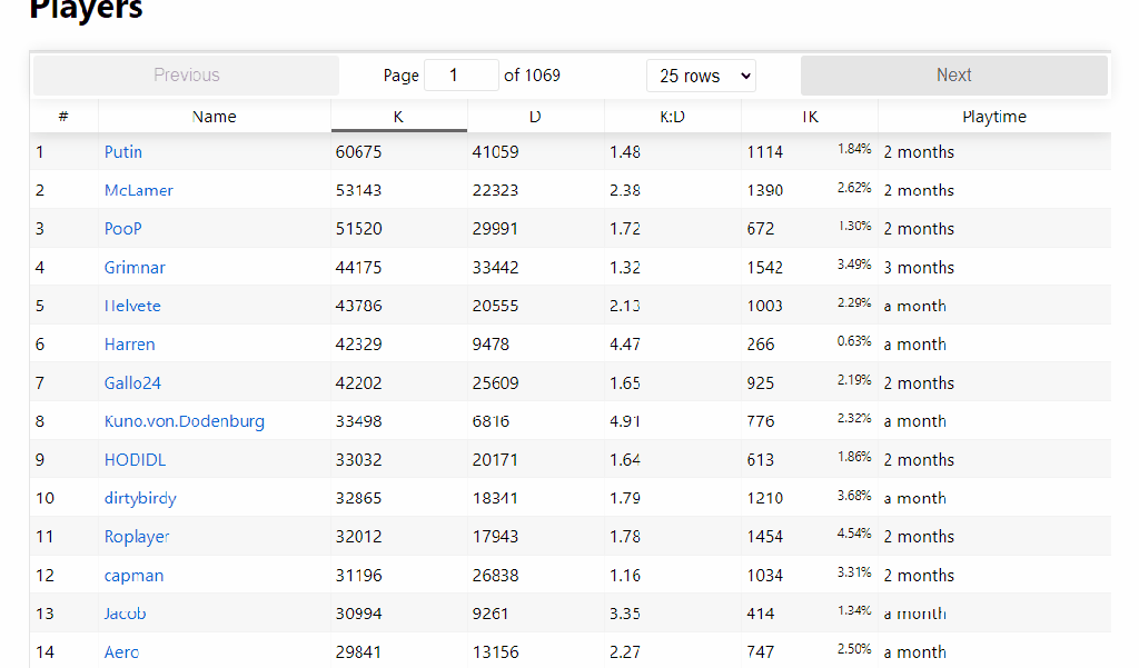
The statistics page for Darkest Hour where players are ranked based on overall kills.
The animation above shows several interesting statistics – Kills, deaths, K:D ratio, team kill count, time played. If you click on any player, then you get additional metrics such as when people play, and their deadliest weapons.
My deadliest weapons.
For example, the weapon that I have the most kills with is the 30 cal machine gun which can be used as an American machine gunner, or on several American tanks. After that, I favor the German Kar 98, then some tanks and other machine guns.
I used to think of myself as a rifleman in the game. I’d use a speciality weapon if the situation called for it, but otherwise, I prefer the accuracy of the rifles. Over time, I started feeling more confident in tanks. I got good enough that RafterMan wouldn’t yell over the coms about noobs being in tanks. Then other people started to recognize that I was an above average tanker, and I embraced the persona with my in game name – Sherman Jesus.
One analysis idea would be to see if I can group players based on their favorite weapons. Can you reliably identify tankers based on their data? Do people have detectable preferences on the different factions (German, Americans, British, and Russian)? Are there weapons that newer versus experienced players prefer? All this is getting a bit ahead of myself because you can’t do any of this unless you find a smart way to get the data.
Data scraping is a technique in which a computer program extracts data from human-readable output coming from another program.
Data scraping is basically getting access to data that you don’t have direct access to. There are technical considerations such as how the data is stored (java, api, html) or structured (xml, tidy, crazy), but there are also legal considerations. It is possible to scrape the wrong thing and get into some pretty serious trouble. I am far from an expert, so go see other resources online to learn about robot.txt and fair use. For my purposes, the lead developer gave me permission to do this. As long as i don’t break anything, we should be fine.
No take backsies.
Problem 1: How the hell do I download the data I want?
Pulling data from Java is difficult.
Most web scraping tutorials teach you how to pull data from HTML tables. These are tables that are static, and if you click on the next page, you get a new web page with new data. Go to IMDB.com and that’s how they have things structured. The data I want access to is locked behind some Java table api stuff.
Java script is a whole other beast. Assuming you want more than the top 25 players, when you click on “next” on the stats page the URL doesn’t change to “page2/” or something. The java script loads the data every time form another database. There isn’t an easy way to write a program that collects the data, clicks on the next 25 players, and repeat 500 times.
I don’t know, maybe there is, and I am too new and dumb to figure it out.
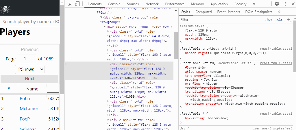
I ended up tinkering around with the stats page and various R packages that would help me out when I came across the network tab in Chrome’s inspect element tool. When I change features of the stats table, the table requests data from another website that looks like an IP address.
This website has the exact features that I need in order to scrape data. The data looks organized and predictable. When I want an additional 25 players, there is a link at the top that I can have a loop click through and get the top 1,000 players easily!
Well… easy in theory.
Over the course of the next week, I’ll bang my head against the wall to try to get this all into a tidy table in R.