In the last post, we figured out where the stats data is stored and that it is stored in an XML format. Did I mention XML? It is a cool data storage format that defies regular one line : one case table formats.
For our purposes, XML helps us manage things like the amount of kills people have with guns. Imagine a giant excel dataset with one column for each kill a player has. Since Putin has around 60,000 kills, that means we would need at least 60,000 columns for every variable we want to track.
- Kills
- With what weapon
- On what map
- Who was the victim
- Where on the map was the killer
- Where on the map was the victim killed
- How far away was the kill
In that example above, we would need 60,000 columns multiplied by 7 variables to captured all of Putin’s data in a flat table.

Instead, XML makes a new line for every event, then it is up to us to figure out how to organize the data.
R has a package called jsonlite that allows us to wrangle this data, so let’s go ahead and install a bunch of packages, and load them. We will then point the package to scrape the data from the stats page, and see what it gives us.
install.packages("rvest")
install.packages("dplyr")
install.packages("reshape2")
install.packages("googleVis")
install.packages("jsonlite")
install.packages("esquisse")
library(rvest)
library(dplyr)
library(jsonlite)
library(esquisse)
library(ggplot2)

most_kills <- fromJSON("http://46.101.44.19/players/most_kills/?format=json&limit=1000&offset=0", flatten = TRUE)

View(most_kills)
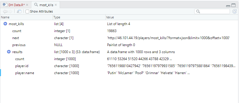
This is what that code produces. This isn’t what I expected. Normally when you load data, you get a data set with rows and columns. Not to worry, this is just XML’s way of trying to be friendly. I can ask it to flatten the data set for me and display that instead. For good measure, I’ll store it as a separate data frame.
dataframe <- flatten(most_kills[["results"]])
View(dataframe)
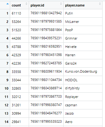
This is more like it!
Something I cannot figure our right now is how to choose what name to display. Some players change their in game name, and all of those names get stored in this XML file. For example, MDK has changed his name to mojo, and now Owls. I’ll want to figure out how to select the first, the last, or show all instances of names, but I’ll leave that for later.
Graphing time!
Let’s make a basic plot based on the count variable. “Counts” is just what kills are called from the database. Let’s look at the distribution of kills among Darkest Hour players.
# histogram with added parameters
hist(dataframe$count,
     main="Distribution of kills in DH top 1,000",
     xlab="Kills",
     breaks=100)
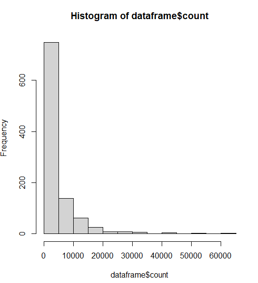
This graph does not have enough breaks. Basically, 90% of the player base has less than 5,000 kills. We need more groups to see the distribution.
ggplot(dataframe) +
  aes(x = count) +
  geom_histogram(bins = 65L, fill = "#0c4c8a") +
  labs(x = "Kills", y = "Count of players", title = "Distribution of top 1,000 player kills") +
  theme_gray()
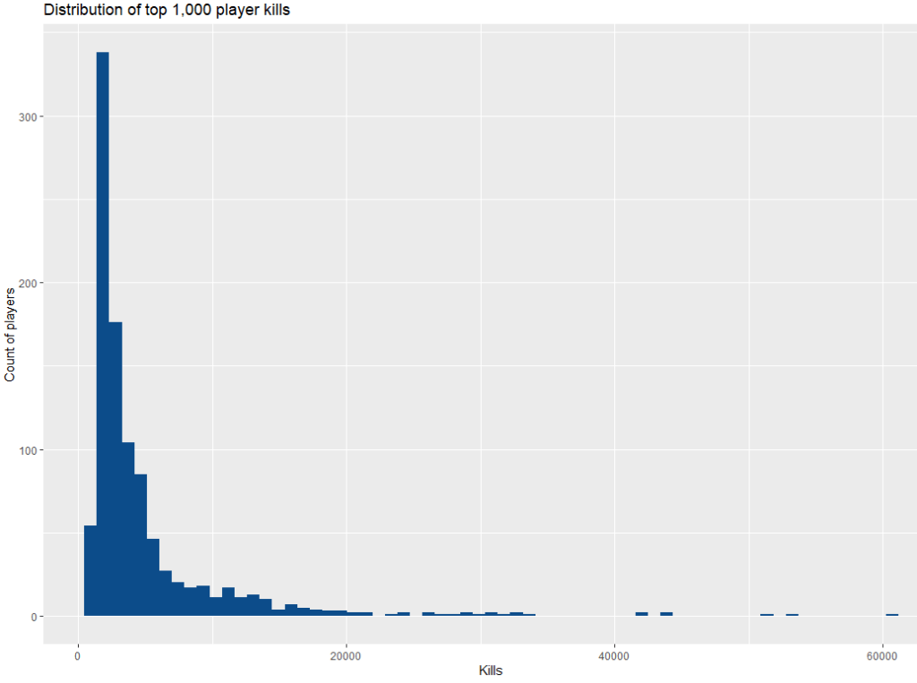
Much better.
Basically, most of the people who have played DH have not even cracked 500 kills. That’s a real shame because we must lose a lot of people before they get addicted to the game, but DH isn’t for everyone. The skill ceiling is pretty steep initially, but the punishment you take from RafterMan is worth it.
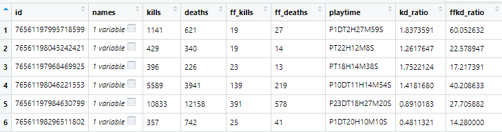
Now I am going to pull from a different XML table that will give me player name, kills, deaths, friendly fire kills, and friendly fire deaths. I’m going to pull the data, calculate some kill:death ratios and kills:friendly fire kill ratios. Finally, i want to get rid of players that have less than 10 kills for graphing purposes. Players with low amount of kills can give us infinite kill:death ratios, and i am more interested in the average DH player with more than 10 kills.
player_list <- fromJSON("http://46.101.44.19/players/?format=json&limit=29000&offset=0", flatten = TRUE)
player_list_df <- flatten(player_list[["results"]])
player_list_df$kd_ratio = player_list_df$kills/player_list_df$deaths
player_list_df$ffkd_ratio = player_list_df$kills/player_list_df$ff_kills
newdata <- subset(player_list_df, player_list_df$deaths > 9 & player_list_df$ff_deaths > 9)
View(newdata )
Finally, let’s get graphing! Let’s brain storm a bit and think about what we should graph.
Graphing kills and deaths is possible, but probably not interesting. The more you play, the more kills and deaths players over time will get. It is largely a function of time, and we would see skillful players having a high kill with the lowest possible deaths.
One aspect of skill that we can measure is the amount of friendly fire kills a player has. Friendly fire kills want to be avoided as much as possible. Killing a teammate locks your guns, lowers your score dramatically, and frustrates your teammate. Reducing your friendly fire kills is a skill because you have to learn team uniforms (Germany, Russian, British, American), gun noises of different guns (Kar, mousin, garand) and vehicles (t34, sherman, panzer, StuGs). Being able to identify who is friendly and who is foe quickly will give you the edge on an enemies position, and make sure that you don’t actively hinder your own team.
So what does the friendly fire rate between new and experienced players look like if we measure experience as the amount of total kills that people have?
newdata %>%
 filter(kills >= 25L & kills <= 31000L & ffkd_ratio <= 100) %>%
 ggplot() +
 aes(x = kills, y = ffkd_ratio) +
 geom_point(size = 1L, colour = "#0c4c8a") +
 geom_smooth(span = 0.75) +
 scale_x_continuous(trans = "log10") +
 labs(x = "Total Kills", y = "Kills per Friendly Fire Kill", title = "Kills and FF Kill Ratio") +
 theme_minimal()
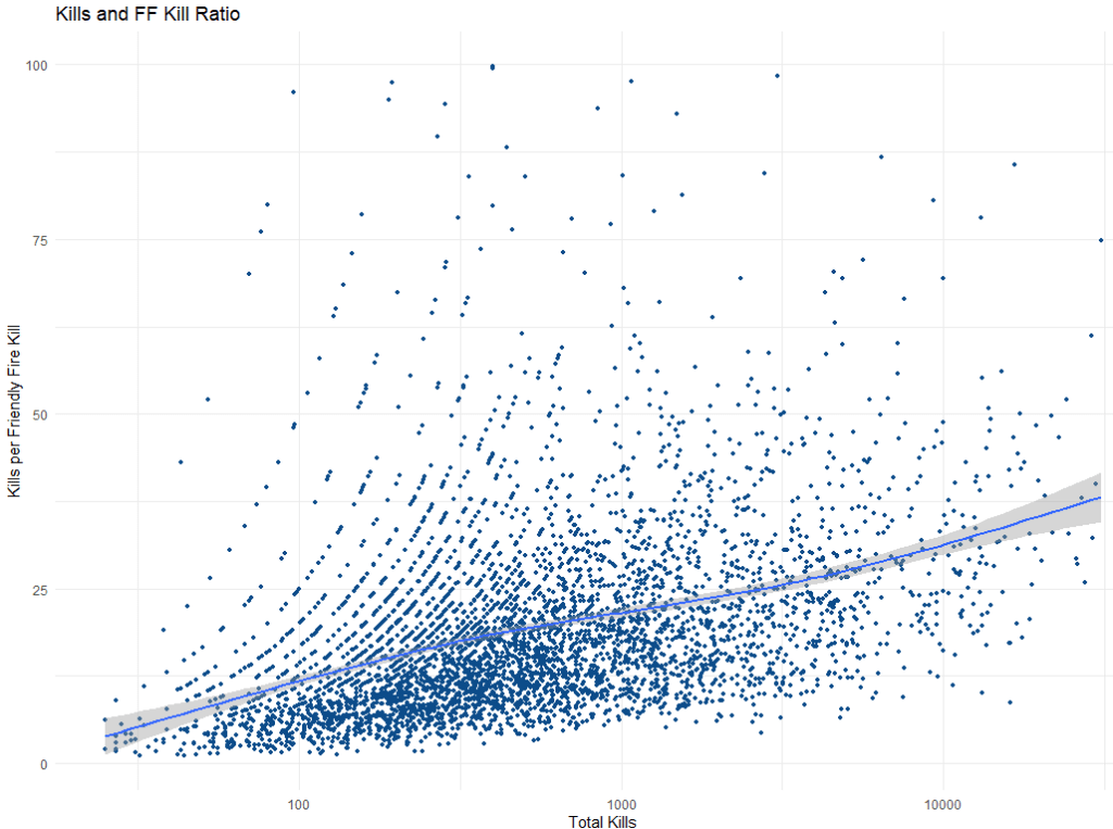
The Y axis tells us how many enemy kills a player gets on average for every one team mate they kill (hopefully on accident). As a player gets more total kills, they kill fewer teammates too.
Players with around 100 kills kill a teammate one out of every 12 kills. Once players earn 1000 kills, then they only kill a friendly one out of 20 kills. Your vets have around 10,000 kills only kill a friendly solider once every 30 kills.
Coming analyses
Below are ideas for analyses on my to do list. I’ll sort the analyses from what I want to answer first to last, but I may jump around if I get stuck on a problem.
- Figure out each players’ top nemesis. Which individual player has killed you the most?
- Figure out each players’ top victim. Which individual player do you
bullykill the most? An important thing to note is that we do not know who we kill anymore. We might only have the slightest idea based on how we know regular players like to play (Eksha flanking with a rifle, Harren holding with a MG, Kuno committing war crimes in a StuG). - Are there detectable segments of players who use different groups of weapons (tankers, riflemen, machine gunners)?
- Are there factional preferences (German, American, British, Russian)? Keep in mind, we have to control for the German bias since Germans are playable on every map, and American, British, and Russian depend on the map.
- Does weapon preference change with experience?
Feel free to leave a comment below or message me on discord ( [Wyle]ShermanJesus ) if you have any analysis suggestions.
